
Case Study: Deutsche Bank

Design concepts: Working in short sprints, it was critical to develop and approve high level page concepts quickly. As a result, many were sketched by hand and developed in this manner until an agreed direction was reached. At this point detailed designs would be put together.

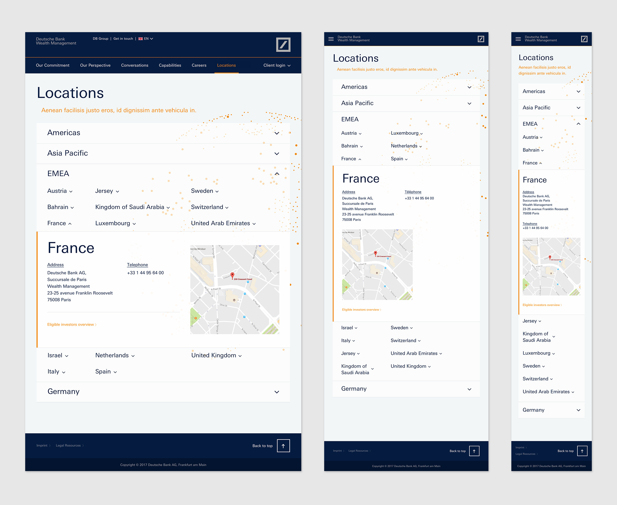
Design concepts (Locations):
With offices around the world, it was important to direct the user to the right location from a very extensive list. There was an opportunity to create something special with the mechanics of this page. These sketches explore the idea of navigating around a branded map to find the desired location.
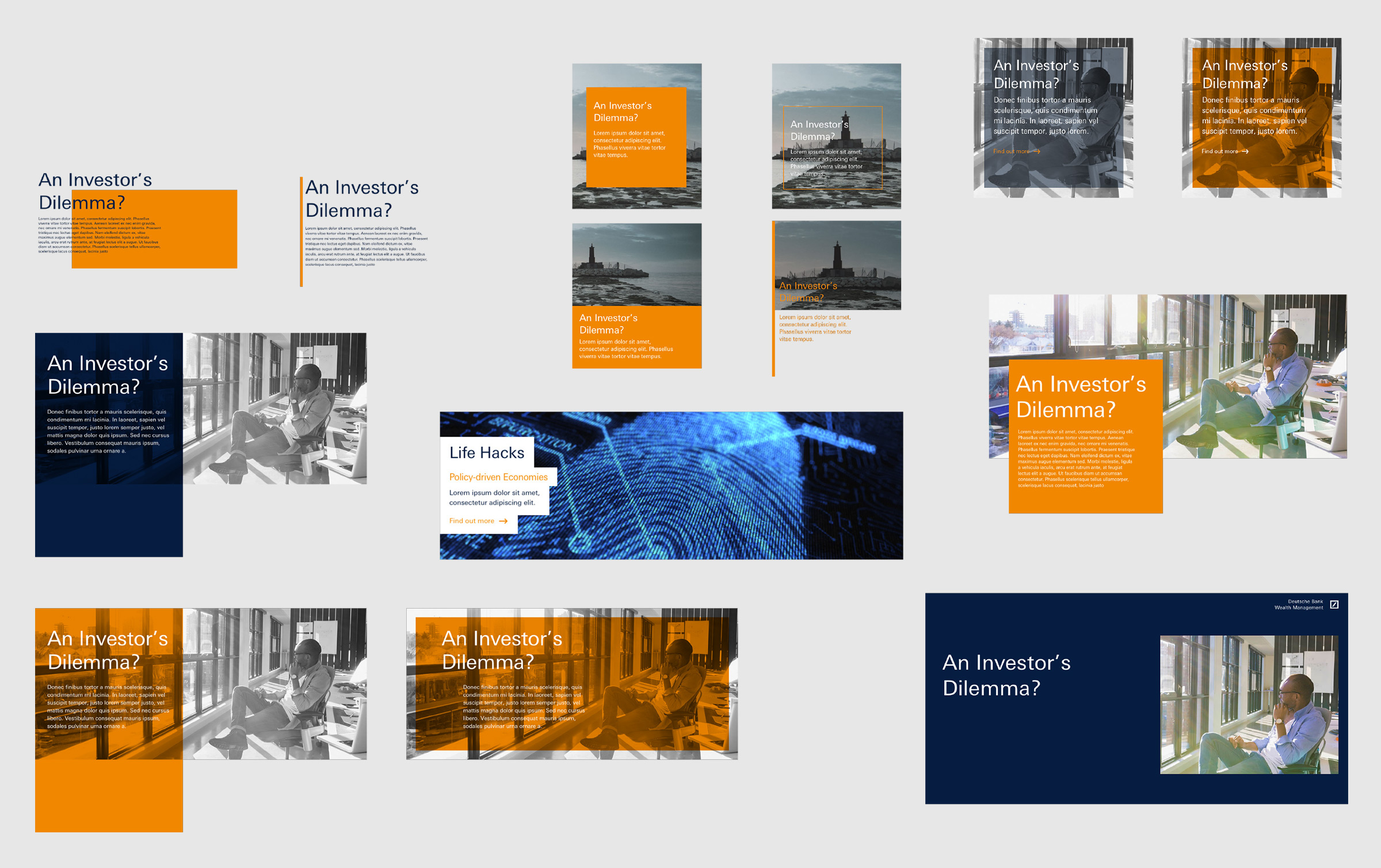
Component development:
Each individual component used was independently developed and stress tested. It was particularly important to ensure the designs could translate into German as this would often prove difficult due to significantly different word length.

Sitemap:
Although this marketing site was separate to the main Deutsche Bank site and its trading partners, it was important to have easy access between the two This site map gives an overview of the navigation within the site and how it links out to other DB sites

Design evolution
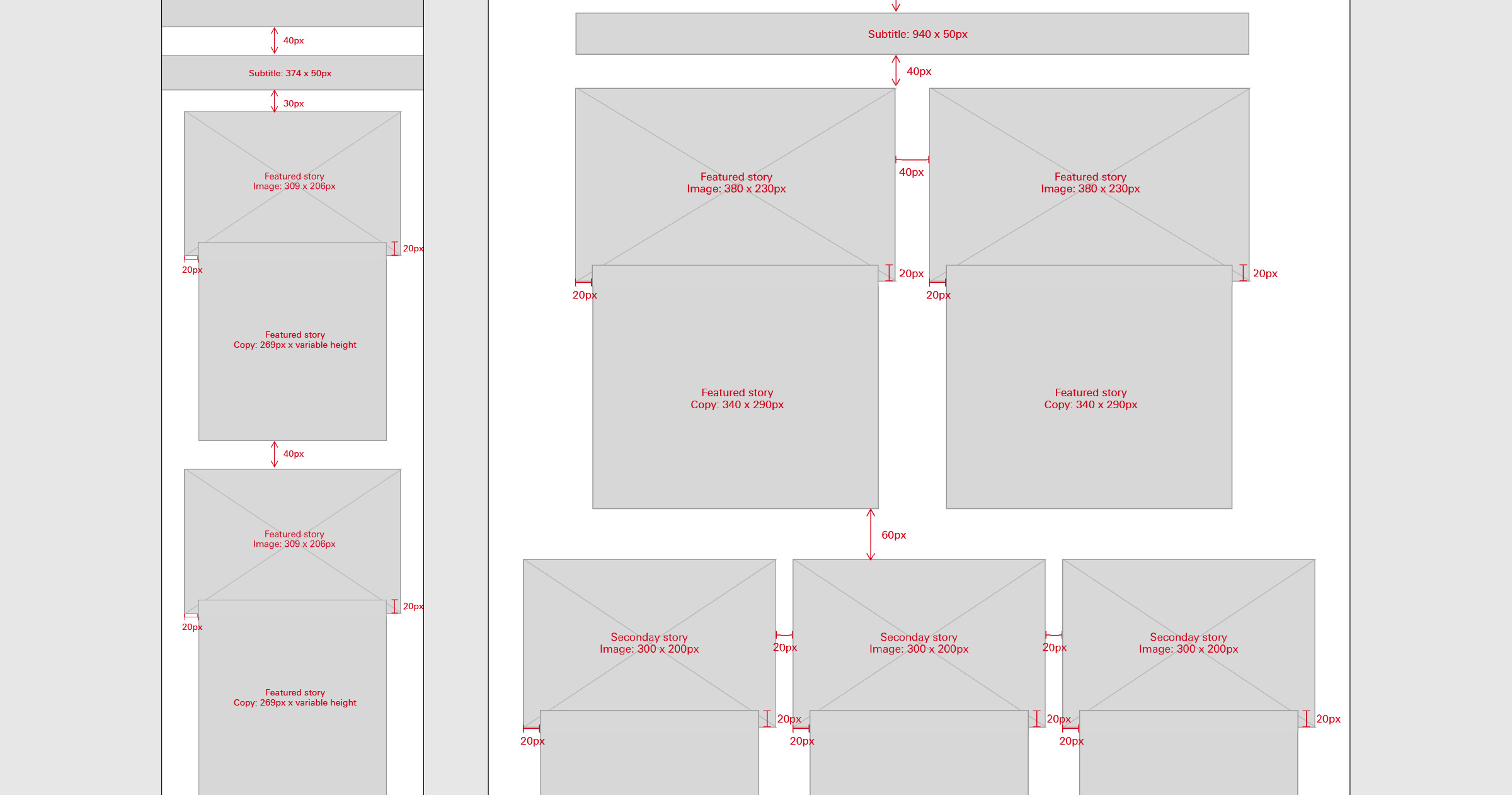
Page specification:
In addition to creating a full InVision prototype of the site, the developers were provided with marked up spec for key pages (such as the homepage shown here). As the content would change regularly these spec documents helped both the developers and content editors update the site easily.
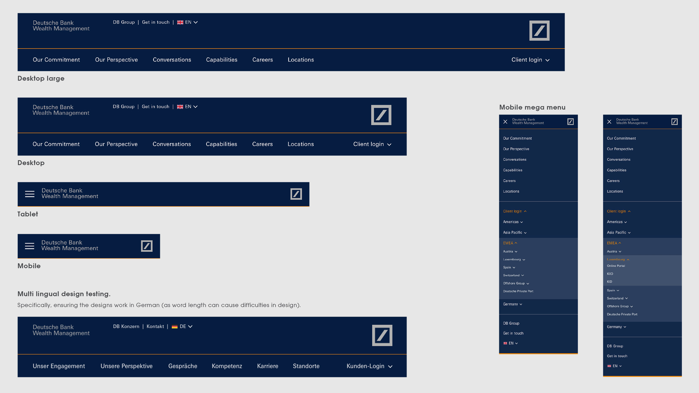
Core navigation

Wireframes to design
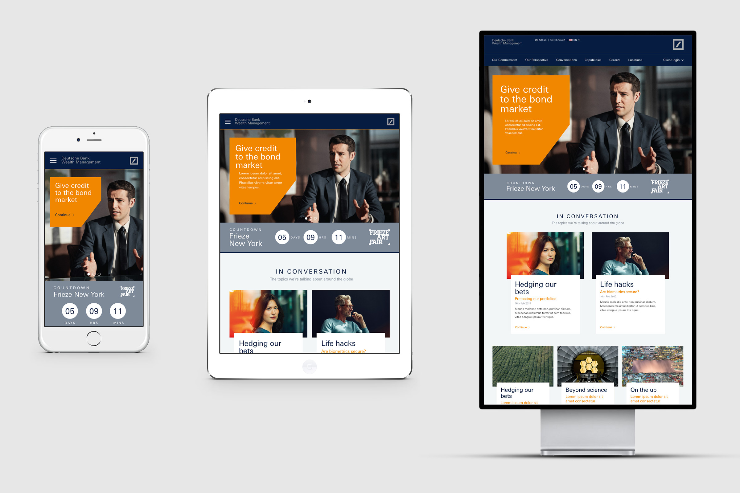
Homepage: Fully responsive design.
One of the key deliverables from the client for this brief was that it was to be a fully responsive site. We focused on ensuring that the user experience from mobile to desktop was consistent throughout.


Article template

Office locations
Responsive layouts